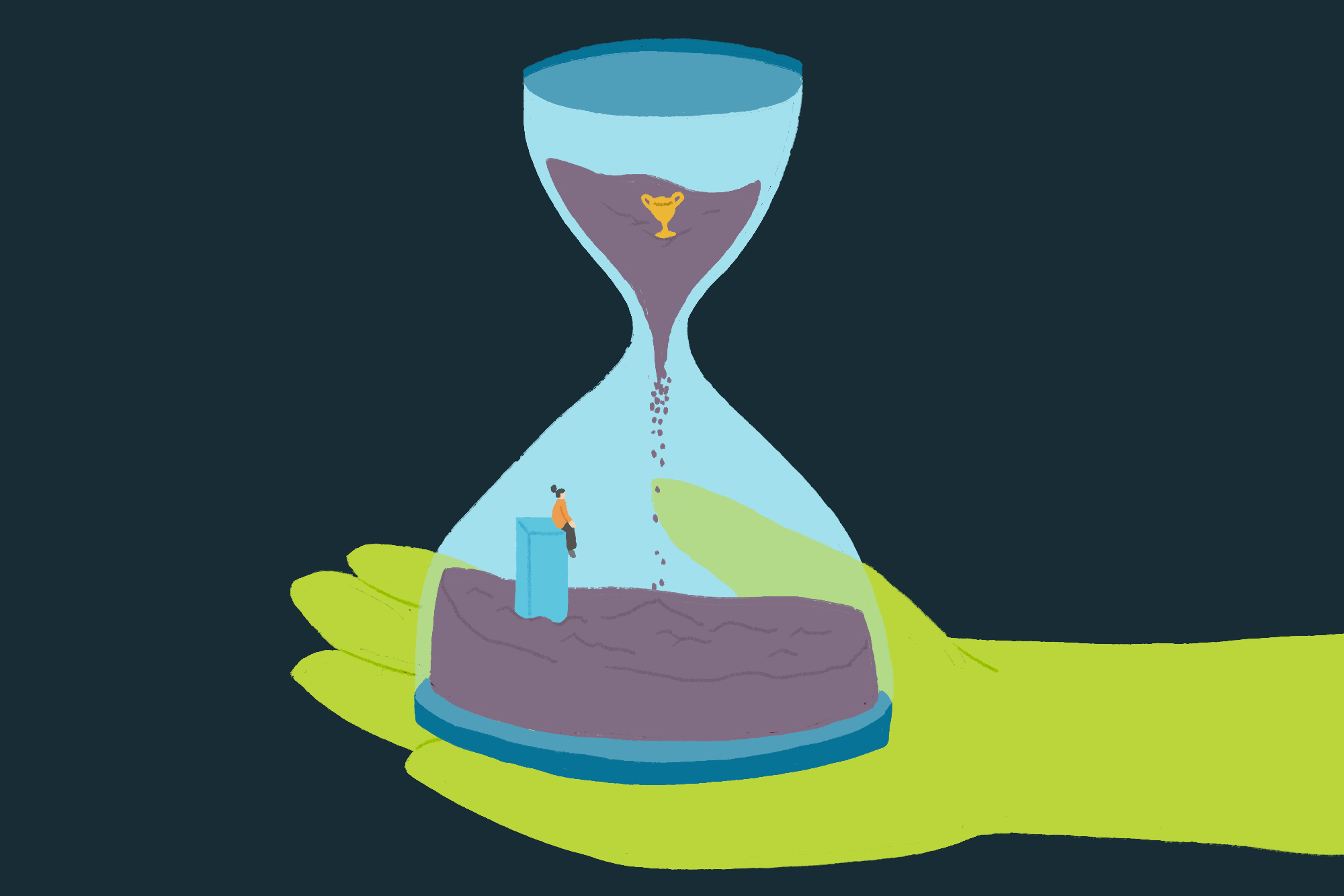
Offering an array of choices might seem like an excellent way to cater to diverse user preferences, but more often than not, it can cause decision fatigue, negatively impacting the user experience and conversion rates. So, how do we strategically minimize this fatigue through effective web design?
Decision Fatigue in Web Design
Decision fatigue can lead to a decline in the quality of decisions after a continuous decision-making process. In web design, users can experience this fatigue when faced with too many choices, leading to indecisiveness, frustration, and eventual disengagement.
Hick’s Law plays a part in this, suggesting that the time to make a decision increases with the number and complexity of choices. Nonetheless, Hick’s Law is just a fraction of a much broader picture. Balancing user choices and decision fatigue effectively also requires understanding principles like settling for the first reasonable option, avoiding potential losses, and making decisions based on readily available information.
Strategies to Minimize Decision Fatigue
To help users make confident decisions without causing fatigue, several tactics can be implemented.
Streamlined Navigation
Develop a logical, intuitive navigation path to eliminate unnecessary decision-making. For example, clear categorization in a website’s menu helps users find what they need without going through numerous options.
Prioritized Choices
Present the users with essential choices first and omit irrelevant ones. A home page showcasing the most popular products instead of an extensive catalog can prevent choice overload.
Restricted Options
Limit the number of options at each decision point to avoid overwhelming users. For instance, in a subscription selection, offering three plans – basic, premium, and advanced, can be more effective than having numerous slightly differing options.
Design Strategies to Reduce Cognitive Load
Strategic design choices can further alleviate decision fatigue.
Consistent Design
Keeping design elements consistent throughout the website simplifies cognitive processing. For instance, maintaining the same style for all buttons or icons aids user recognition and reduces the cognitive load.
Utilizing Familiar Patterns
Use recognizable icons and layouts to reduce cognitive effort and decision-making time. Employing standard symbols for shopping carts or menus enables users to interact with your website effortlessly.
Anticipatory Design
Predicting user actions and simplifying processes can lessen the number of decisions a user needs to make. Autofilling forms based on past user data is one such example.
Effective Error Handling
Minimize frustration and decision fatigue by guiding users effectively when errors occur. For instance, a clear error message with a suggested solution can keep a user engaged, even in the event of a mistake.
Final Thoughts
Taking into account the principles of decision fatigue and integrating the mentioned design strategies, your web design can become more user-friendly, reducing decision fatigue. Our overview aims to set you on the right path but remember, UX practices often involve deeper explorations and constant testing. Your understanding of decision fatigue will deepen as you engage more with UX research and real-world testing.
While we’re grappling with the complexities of choice, remember there’s another potent tool at your disposal – social proof. Using elements like reviews, testimonials, or popularity indicators can steer users toward decisions others have already made, thus easing their decision-making process. To learn more about how social proof can reinforce user decisions, we invite you to read our article on the topic.
In a world where choice overload is a reality, appreciating the power of simplicity and efficiency in decision-making is invaluable. It’s about striking that optimal balance – giving users ample choice without sparking decision fatigue.
This post may contain affiliate links. See our disclosure about affiliate links here.


